
Building a portfolio layout using Jekyll and OpenAI o3-mini
Tags: Prompt Engineering, o3-mini, Jekyll
Categories: Blog
TLDR
Task: create a modular, modern template for a “portfolio” section. This should integrate nicely with my existing website template and its modular structure.
Solution: use o3-mini (just released yesterday at the time of writing!) to create relevant assets: html, Jekyll custom instructions, and the webpage html. In practice:
- Ingest the whole website using Gitingest, an easy-to-use API that produces an LLM-friendly textual representation of your GitHub repo (file structure and their content).
- Craft a suitable prompt for o3-mini magic to happen
- Iterate prompting until a suitable solution is reached
Outcome: check for yourself, I think it looks great! It took about 1 hour between writing prompts, applying changes, iterating designs and doing final manual tweaks.
My idea
Today I decided to improve the Portfolio section of the website, which I originally left as a stump. I was picturing a modern looking grid, modular layout. Each project would be a block with these characteristics:
- A big image to engage the viewers
- A title
- Tags representing the main features of the project
- A short (1-2 lines) description
This would be a minimal amount of information, and in practice I expect it would not suffice to understand what the project was about, what was the problem being addresses, the challenges, solutions and outcomes. In short, it’s a first presentation for visitors to select the project they want to focus on, but it provides insufficient content. Yet, I believe directing to a full article on-click is not ideal either because that may be just too much content.
Hence, the second set of features I was looking for where:
- A pop-up on mouse over, showing the title, tags, a longer description, and a link to the article post
- For the pop-up to integrate nicely in the layout
- For the layout to be responsive, adapt well to smaller screens, and be vertically scrollable
Everything should be modular, with a separate config file where I specify the content of each project (title, tags, and so on), and the layout would be automatically applied. Yes, I wanted a template.
The first step is always a Google search, however I know that integrating existing mock-ups in my website could be not straightforward: I wanted to maintain the side bar with my info, footer and nav bar, and these elements rescale based on the screen size. Moreover, I kind of new already what I wanted.
The solution: use LLMs for fast prototyping
Given that time is precious and all of that, I decided to have an LLM do it for me. I have already used Claude Artifacts for generating a data labeling tool before, which is very similar in spirit to creating a webpage template. I thought it would be interesting to use OpenAI o3-mini this time around. It was just released yesterday (at the time of writing), I am very excited to see how it performs!
The first step is to make the LLM aware of the state of the website: which webpages exists, what the template it and what modules it could/should re-use. Also, this ensures it can match the coding style and design used until now. For this, I relied on Gitingest, an easy-to-use API that produces an LLM-friendly textual representation of your GitHub repo (file structure and their content). Check it out if you are not familiar with it, it’s super useful!
Next, let’s summarize the task for the LLM. For these reasoning models, the general consensus it to describe what you want it to do, rather than how to do it. This is also my experience. The prompt reflects this idea:
[Gitingest content goes here]
I want to re-write the “portfolio.md”. This should become a proper professional page where I can display my projects. The way I am imagining this page:
Project module. Each project has a picture, a title, tags and a short description. On mouse over, the image expands, goes on background, and a lengthier textual explanation is placed on foreground. On click, it opens a target page. I want the webpage size to be 1.5 times bigger than the curent “single” content layout. I would say 2 or 3 projects per row. Make the design responsive and follow best practices.
The appoach should follow minimal-mistakes and jekyll standard of modular development. Hence, each project is its own module. You think of the best way to implement this. Please also create 4-5 such projects (fake) so that I can see how it would look like.
Make it look pretty. I wanto you ro tell me each file that you edit, what/ where I shouldadd, and if new files are needed, where should they be placed and with what content.
As you see, I was quite to the point in the prompt. I usually just write it how it comes to mind, sometimes I do not even correct typos. The model diligently produced all the necessary files, including some mock-up template content. Here is the output, truncated and slightly edited for brevity:
1) Create/Update
_data/projects.ymlAdd a new data file
_data/projects.yml. It might look like this:- title: "Neural Style Transfer Playground" tags: ["Deep Learning", "Computer Vision"] description: "Realtime style transfer using a lightweight CNN. Trained on classical paintings, it converts any photo into a Monet-like style in seconds." detail: "This project demonstrates how to train a feed-forward CNN for style transfer, achieving near real-time performance. It supports custom user-defined styles and runs on CPU or GPU seamlessly." link: "/projects/neural-style-transfer" image_path: "/assets/images/portfolio/nst_thumbnail.jpg" ...2) Custom SCSS (Recommended: a partial in
_sass/minimal-mistakes/_portfolio.scss)Create or update
_sass/minimal-mistakes/_portfolio.scss:// _portfolio.scss // Here we style the portfolio grid to have 2 or 3 columns, hover effects, etc. .portfolio-grid { display: grid; grid-gap: 2em; margin-top: 2em; // Adjust how many column ...… And so on
Let’s see how that looked!
Version 1
After adding all the necessary files to the website, and running bundle exec jekyll serve, we obtain
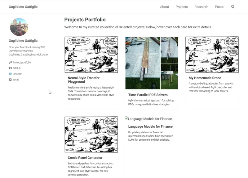 Here, I added some of the images I had around to see how it would look. The content was instead generated by the model. First of all, from a conceptual standpoint, I really like the modularization solution that it provided. Having each project be defined as a key-value structure in the
 _data/projects.yml is a good solution. Especially, I do not have to fiddle with html/CSS every time I want to add a project. In fact, I do not even need to make any changes to the Portfolio page.
However, it’s easy to see that while the mouse-over works well, there are obvious issues. This is bound to the image, while in principle it could cover the whole grid cell. Moreover, if the content to be showed in the overlay is too much, it will be truncated. Let’s fix this.
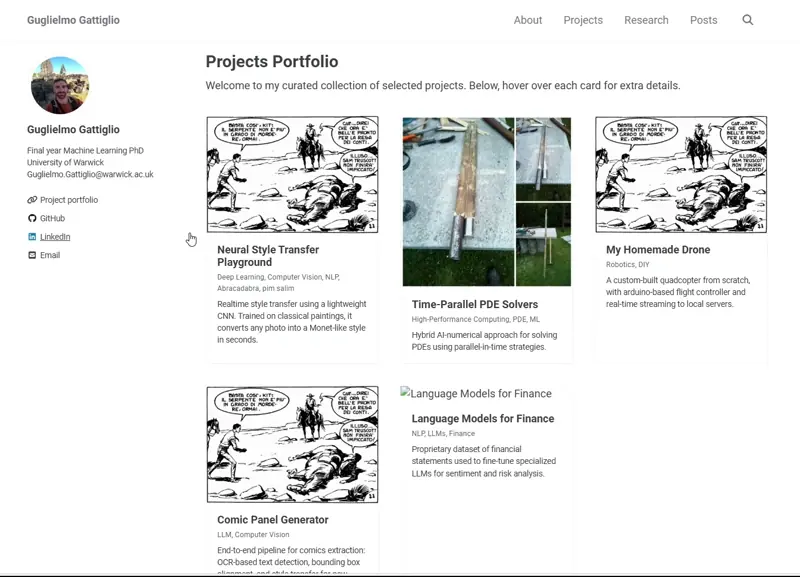
Version 2
This was a minor change, basically I just asked it to fix the previous problem without much guidance as to what I wanted him to do:
Great work! Here are the cnages I would like to see:
What we currently have in each block:
- Image
- Title
- Description
On mousee over, I see:- The title
- the tags
- A longer description
- a button
I like this structure. Here are the things that need to be changed:- I want the tag to additionally show on the main block, so not only on mouse over
- The mouse over remains constrained within the image size. This is not okay, it should have it’s own dimension based on how much text there is. This should looks good. Some example could be for the mouse over display to go a bit beyond the edges of the project block, but still be centered on the project (so that I can move my mouse onto another block and focus on it).
Feel free to think what’s the best appraoch for the second pooint above, mine it’s jsut a suggestions. Basically, I do not like that if the image is small, I need to be considerate of how much content I put in the description
This is what it came up. Moving in the right direction, but still things that I do not like in there. Now, I could easily fix most of these myself (browser Inspect very helpful here), but I wanted to see how far I could push it.
Version 3
I broke down the last few changes into three prompts, mostly because I was figuring out which layout I wanted as I went (I was not thinking of scrollable overlay at the beginning).
Prompt 1
That’s better now. Final change, I would like the grid_overlay to always occupy the full grid__item container space. Right now the vertical height varies based on the content. Please retain min-width and max-width, I’d like to be able to control that
Prompt 2
How Can I make the overlay scrollable (downwards)?
Prompt 3
Great. Now I would like for the overlay description to be able to accept markdown conent, and properly format it. I tried adding markwodnify to the grid building, but the font of the markdown is now much bigger. That should not be happening
This bring to pretty much the final version. Note that in answering the above, it autonomously took care of different screen size and otehr compatibility issues with the overlay. Here is how it looks:
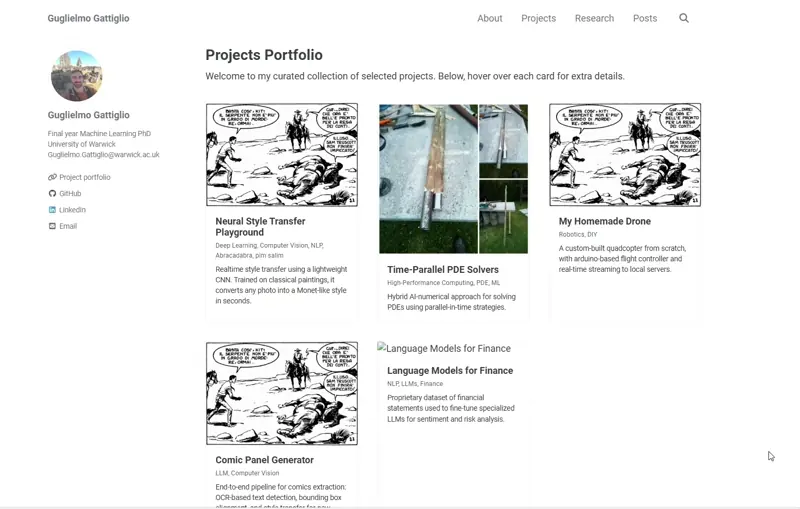
There is no escape from a bit of manual refinements in my opinion, especially in creative applications. So, I made some manual touch-ups myself, and the final product was ready (go check it out here).
A (failed) different approach
Remember as I said at the beginning that these models work best when guided in what you want them to achieve? Unlike non-reasoning models, reasoning ones shine when constraints and specific goals are set out. Nevertheless, I wanted to check if I could get better outcomes out of the model by loosely describing the task and letting it decide autonomously the best way to achieve the goal. This goes along the lines of “be creative and generate a modular portfolio page that looks modern and amazing!”.
Unsurprisingly, it did not work quite as well:
- No overlay on mouse over
- The overlay is full-screen
- Color contrast is wrong
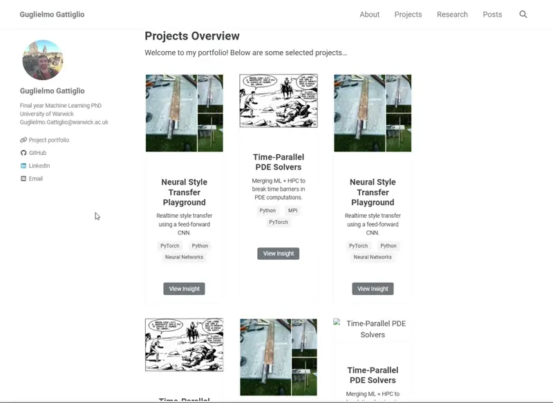
Nothing that we could have not recovered from, I am sure with a few prompts we would have gotten this concept to the same level as the previous one. But I really prefer the mouse over ![]()
- Guglielmo